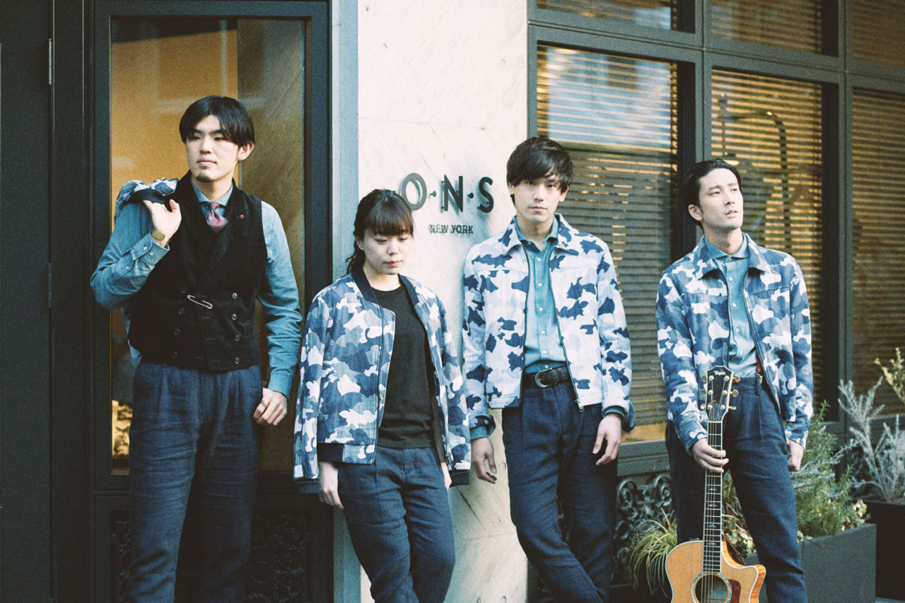
Mixing Mediums: Jimmy Mezei x O.N.S

To see the work of Red Hook, Brooklyn-based artist Jimmy Mezei up close and personal is nothing short of entrancing. With such a striking style and knack for balancing vibrant energy with playful movement, it’s easy to see why he’s enjoyed success within the realm of design. Originally from Southern Ontario, Canada, Mezei specializes in graphic design, illustration, and painting. In his professional work, he combines traditional materials with digital techniques resulting in sincere and harmonious visuals. Each piece marks its own visual territory, rarely being explicitly literal—but pushing loose albeit beautiful concepts that are interpreted through brilliant color choice, technique, and patterns. Jimmy recently completed a visually stunning mural for our 71 Greene, Soho flagship. See our interview with him below:
We’re incredibly excited to be working with you on the O.N.S Mural collaboration. How has this project been different from your past collaborations?
This project was actually somewhat similar to what I would consider the more effective collaborations I’ve done in the past. Chris Tuyay approached me about doing something for the space, and I was happy that he was excited when I suggested a mural that included installation elements. I think for any collaboration to be successful, it needs that openness and a bit of trust on both sides to make something you’re both happy with. What’s different about this project is the space itself—it was a nice challenge to wrap the design around a corner and make it flow into the back.
https://vimeo.com/213550722
We especially love the colors, shapes, and patterns used in the mural. Where did the inspiration come from?
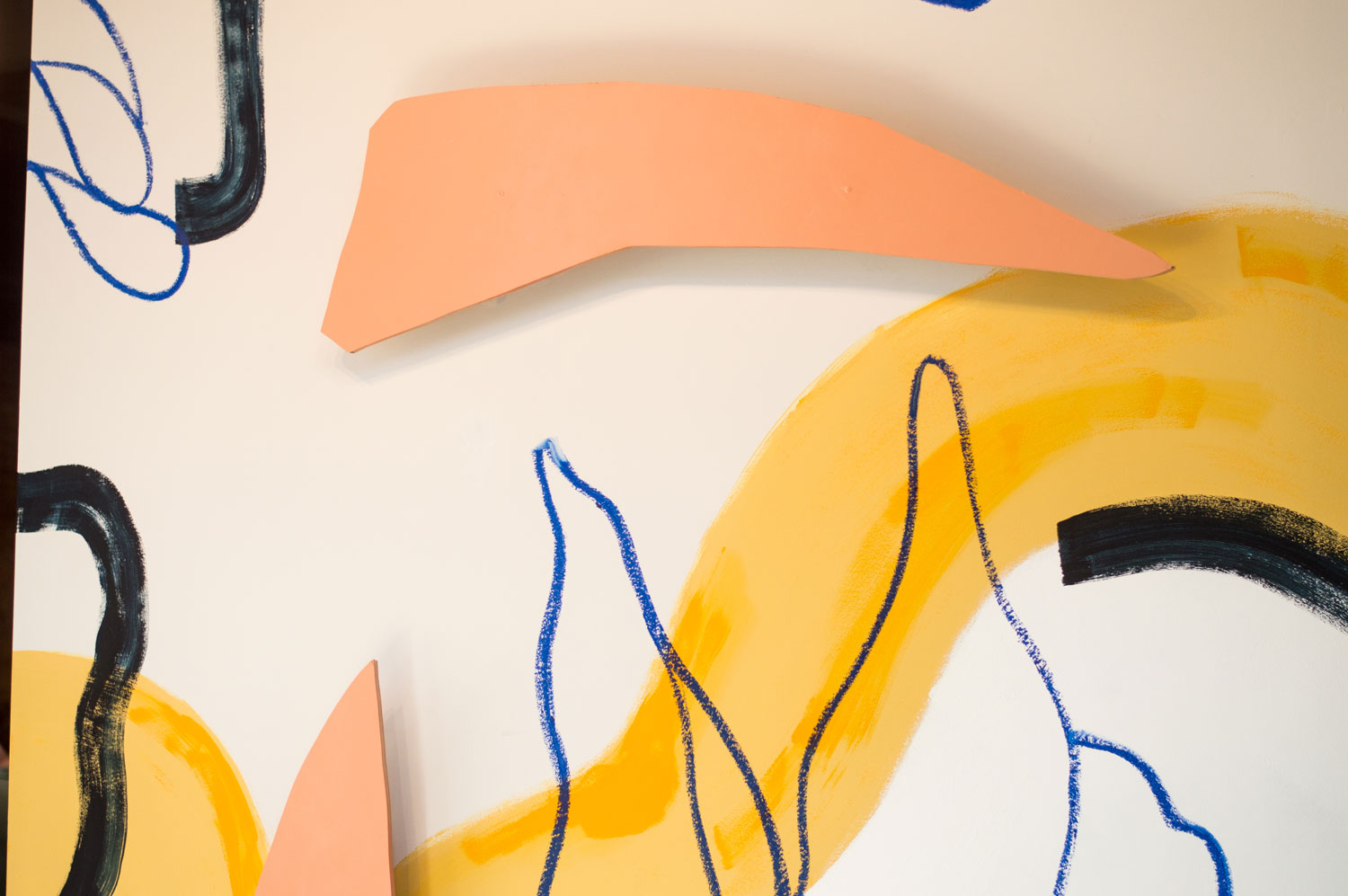
The space itself is beautiful. The café area has a great, long line of skylights and I knew I wanted to play with that natural light. The cut-outs were created in direct response to the space, meant to add dimensionality, knowing that the light from those windows would allow the cut-outs to throw dynamic shadows throughout the day. I first used those types of forms during a residency in California last fall. I was working on a series of work that had to do with “the unknown” and how to trust your process to make something new. I went out to the residency not knowing what I would end up making and when I started work on the series I combined techniques, (paper cuts, water color, contours) to discover something new. This process lead to new motifs for me and ended up informing the series itself—with that feeling of searching for what you don’t yet know. The forms developed from abstractions of plant studies and an overall playful approach to each medium. I tried not to self-edit when I was drawing, and then arranged what I found most interesting (the off-cut of a leaf, a single-weight line in watercolor, or an abstracted plant figure in contour) into abstract compositions of form and color.
The space itself is beautiful. The café area has a great, long line of skylights and I knew I wanted to play with that natural light.
Are paper-cut shapes a reoccurring theme for your work? How did that start?
Paper-cutting is something I learned from my mentor, Tom Slaughter. When I first moved to New York, I helped him ready a few shows and observed firsthand his approach to the medium. I was enamored with that process and loved how it translated your drawing into this stark, somewhat abstracted image by clever use of negative space.
What’s your process like when you first get an idea for a new design?
Pretty standard, I think—thumbnails, arrange, refine, repeat if necessary.
When do you feel the most creative?
Getting back into my studio after traveling.
It looks like you’ve used a few different techniques to install the mural. Can you walk us through the materials you used?
I had recently been itching to work on a larger scale and did a set of privacy screens for which I used similar techniques. The materials I use are just an extension, or expansion, of what I would use on a mock-up for the project. I do this deliberately, to retain the same balance of textures. For the mural mock-up, I used watercolor, pencil crayon, and paper-cuts; for the actual installation the watercolor was replaced with slightly watered-down Flashe Paint, the pencil crayon became an oil bar, and the paper-cuts were created from raised, painted plywood panels.
Are there any new materials or mediums you’d like to experiment with?
I am intrigued by the 3-dimensional elements. I’ve begun to play with and would like to see where they might take me.
What else do you have planned for 2017?
Paint!
To keep up with Jimmy Mezei, follow him on Instagram here. Also, check out his website here.
If you liked this story, check out more in our Urban Transplants issue.